Colours
At Art of Where, we love colour. We have put an extraordinary amount of time into colour technology and creating colour profiles specific to our fabrics. We aim to match your artwork colours as accurately as possible when printing onto fabric.There are a few things that can make print colours turn our different than expected.
Monitor Colors- No 2 monitors are the same! Depending on how your screen is lit to the cable you use to plug it in, the colours you see on your monitor can vary quite a bit from what will actually print on the fabric. If you’re seeing a big difference between your print and what you expected, it would be a good first step to check your artwork on another monitor.
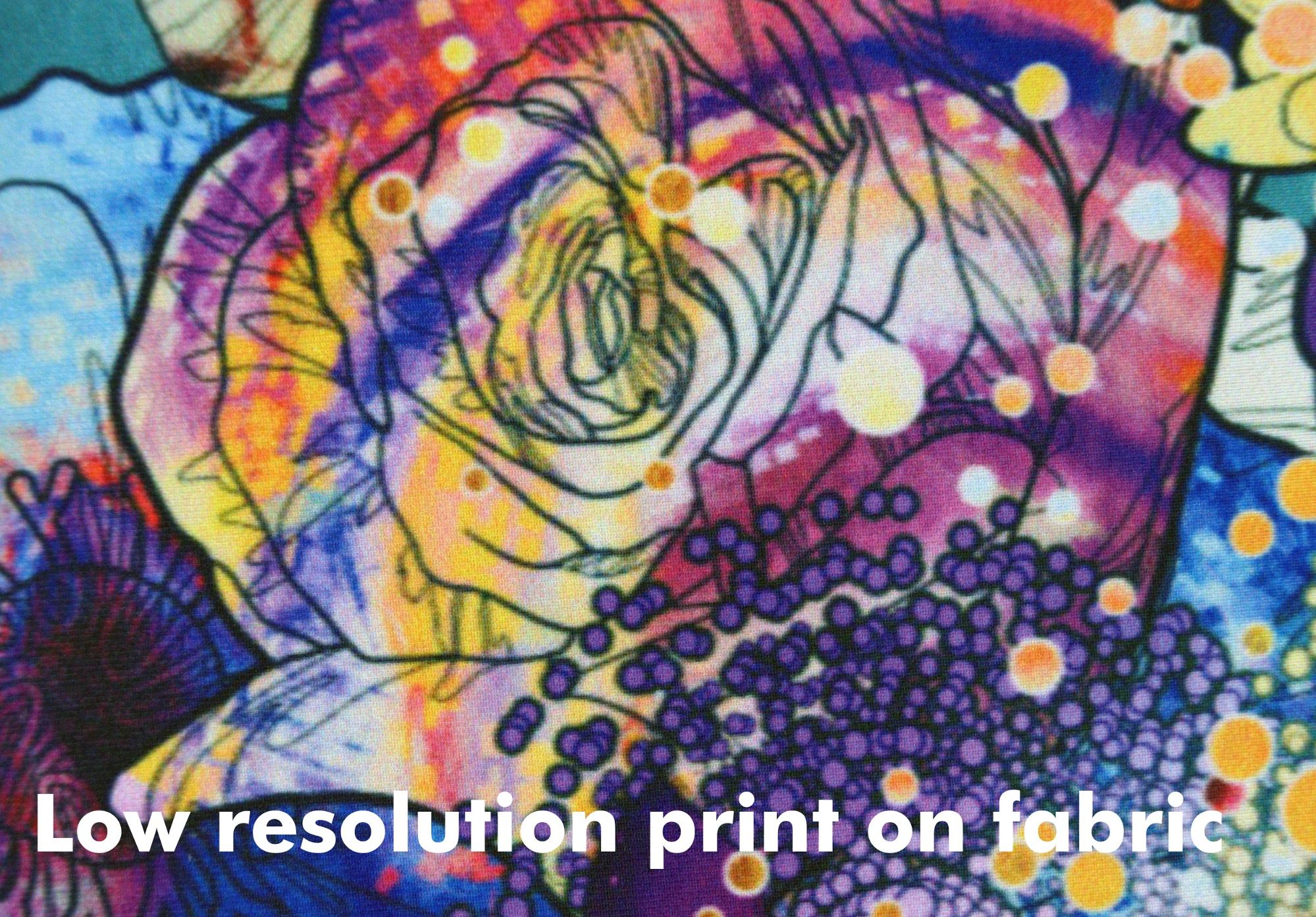
Low resolution artwork- If your artwork is not prepared to our suggested dpi, the pixels are blown out or blurry, you may see shifting of print colours. By following our design guidelines, you’ll be able to ensure your artwork is the right colour space and print quality for our products.
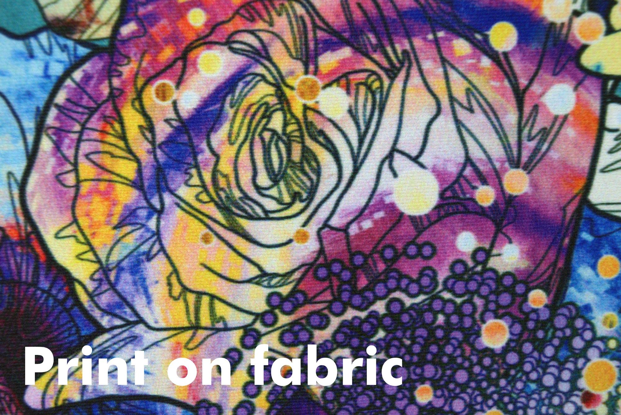
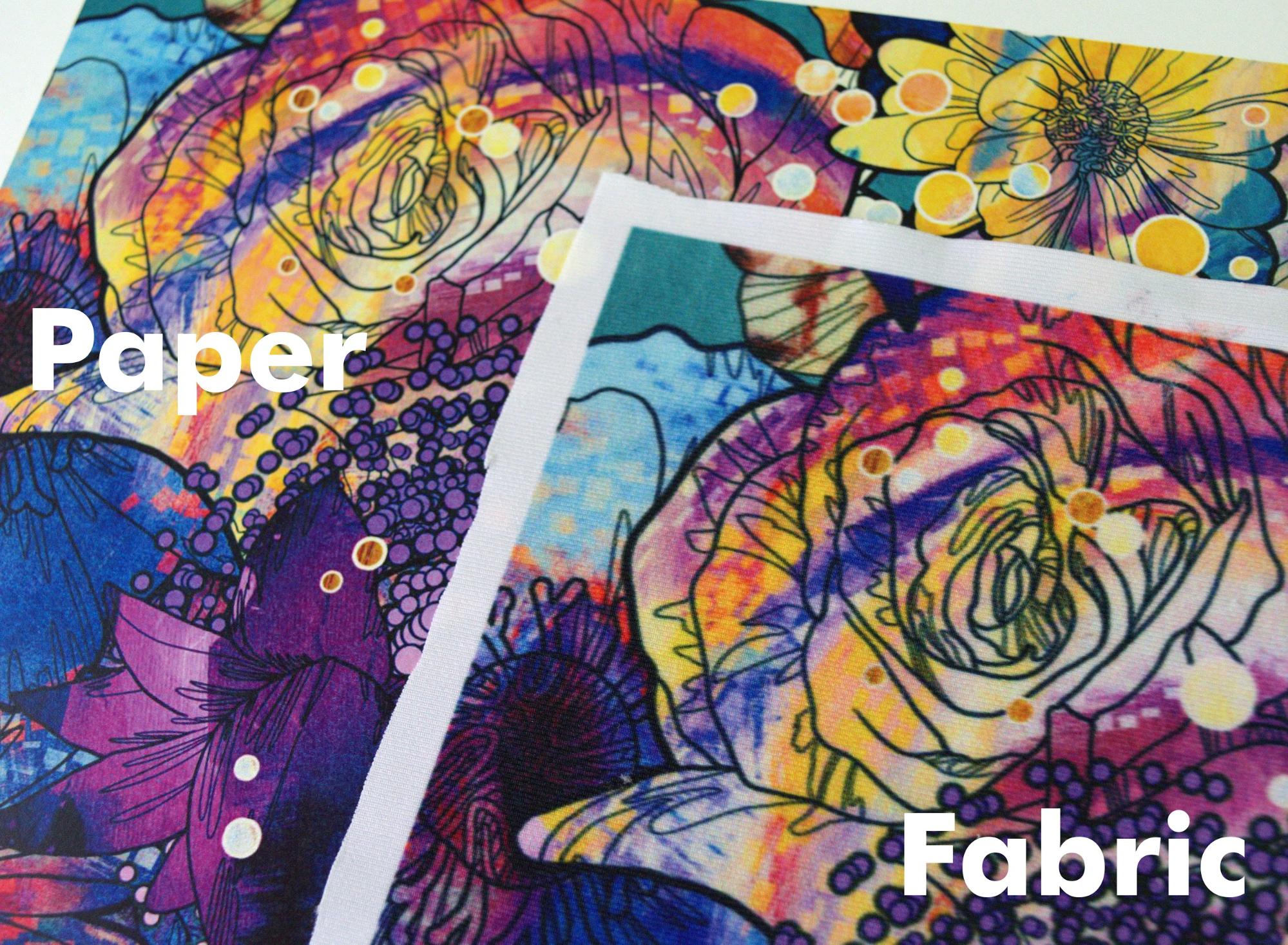
Paper vs. Fabric- Comparing prints on paper to prints on fabric is impossible. The surface of paper is much smoother and reacts to ink differently. Fabric is spongy and the fibers absorb ink unlike paper where ink rests on the surface. Depending on the color we wish to achieve on the fabric, we have to put down different amounts of ink (black being the most) unlike on paper where the ink is evenly distributed. It is best to understand that comparing prints on paper to prints on fabric will, in almost all, cases show differences in the print results and colours.